institution:emory university / musée du Louvre advisor:dr. bonna wescoat time:summer 2014 and 2015 project:excavation plan / rendered images / 3D modeling location:samothrace, evros, greece
website: American Excavations at Samothrace
Dr. Bonna Wescoat, professor of art history at Emory University and director of excavations at the Sanctuary of the Great Gods, travels every summer with a team of students and professionals to the Greek island of Samothrace in the north Aegean. This is the famed home of the Winged Victory (Nike), the world’s most famous Hellenistic sculpture which sits atop the Daru staircase at the Louvre in Paris. During the summers of 2014 and 2015, I served as the team architect.
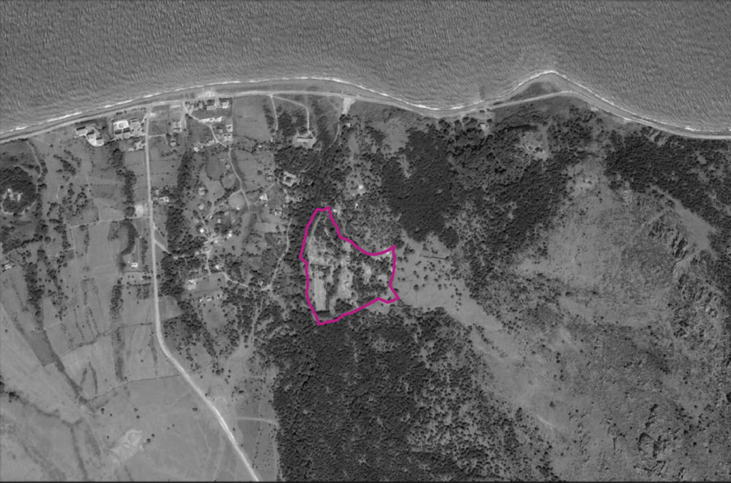
Sanctuary Outline from Above
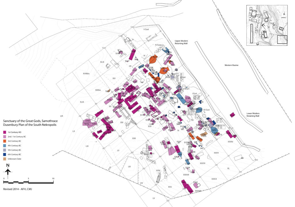
The first of my two major projects was to compose a drawing of the Nekropolis excavation and ground plan (right image). Elsbeth Dusenbury conducted a series of exhaustive excavations of the Nekropolis during the late 1950s and early 60s. Her findings were drawn at a 1:20 scale, which were arranged and coded in a 4’ x 4’ grid overlay of the Nekropolis. The drawings included various pottery, pithoi, sarcophagi, and even skeletons. Following Dusenbury’s system of codification for these drawings, we arranged them in the grid and traced the findings in AutoCAD. The result was a published layered PDF of Dusenbury’s discoveries, color coded by century, available to download at samothrace.emory.edu.
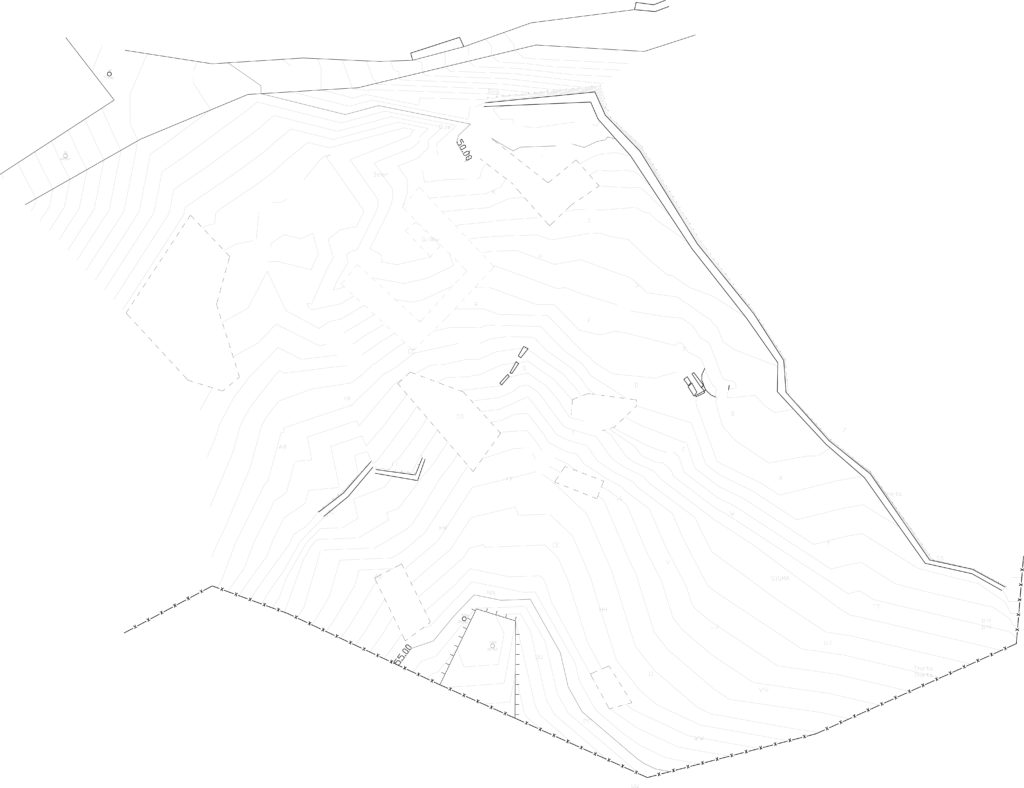
Existing Nekropolis Site Plan
Elsbeth Dusenbury Drawings with Grid Overlay
Published Drawing of Dusenbury Excavations on Nekroplis Site Plan
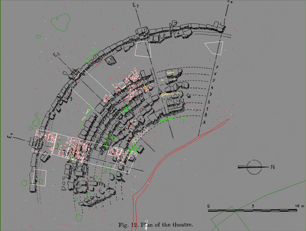
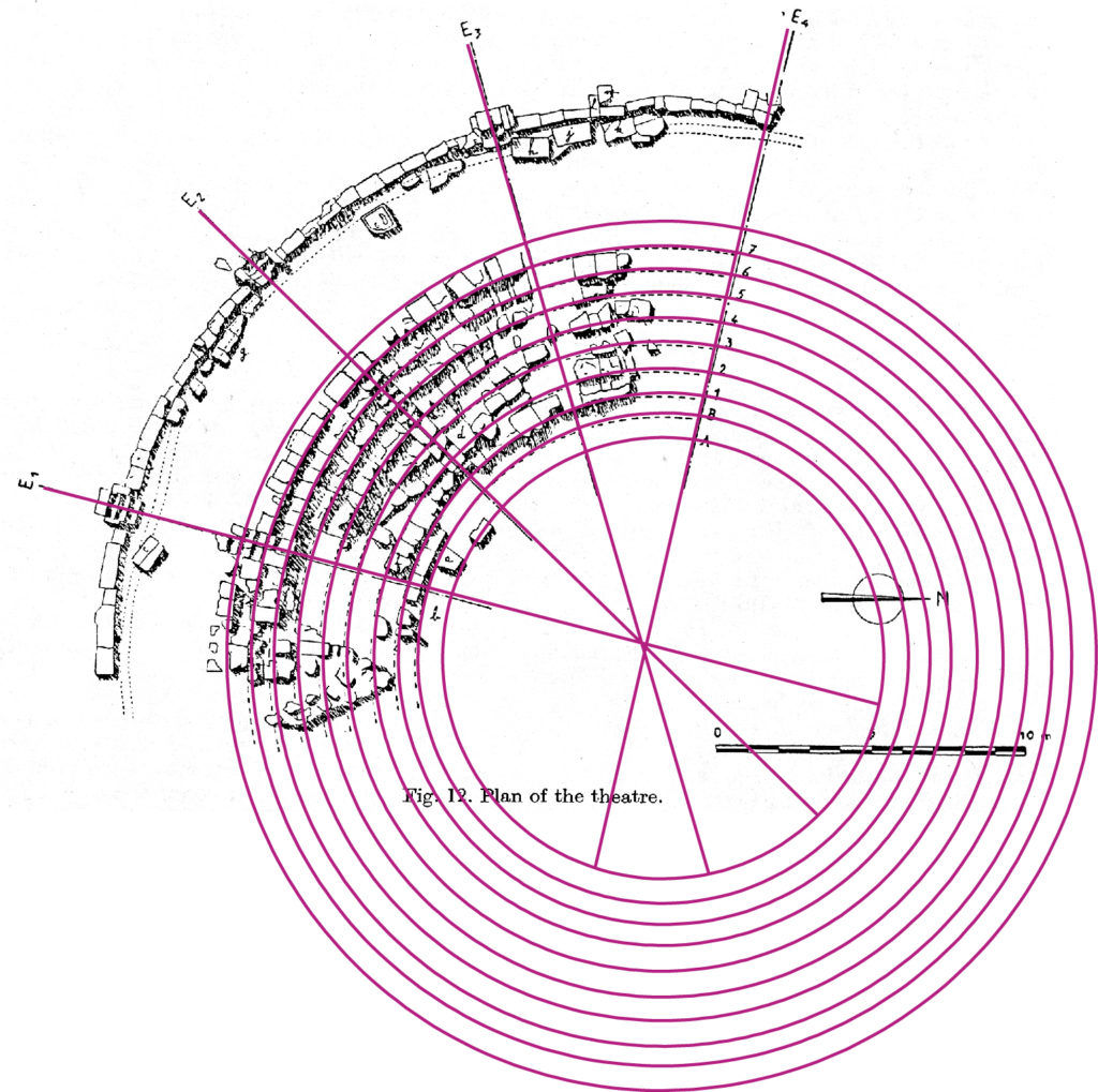
The second of my main projects was a reconstruction of the theater and to represent its relational proximity to the monument that house the Nike sculpture. The process began with a 1923 scaled drawing of the theater blocks, which have since been looted. Using this drawing, we projected the rings of the theater rows. From the texts written of this excavation, we could estimate how many rows lay in the lower section before the diazoma and how many rows above. The challenge was to align the textual evidence with collected survey data of the extant theater.
From the French texts and from Classical theater design at sanctuaries contemporary to Samothrace, we came to a reasonable conclusion of the height of the theater (well above today’s ground level due to seasonal flooding), as well as the number of rows and bays. This projection was set against the archeological evidence and survey data to check its accuracy.
Survey Data Overlay on Scaled Chapouthier Drawing from French Excavations of 1923
Projection Lines and Theater Row Radii Overlay on Chapouthier Drawing
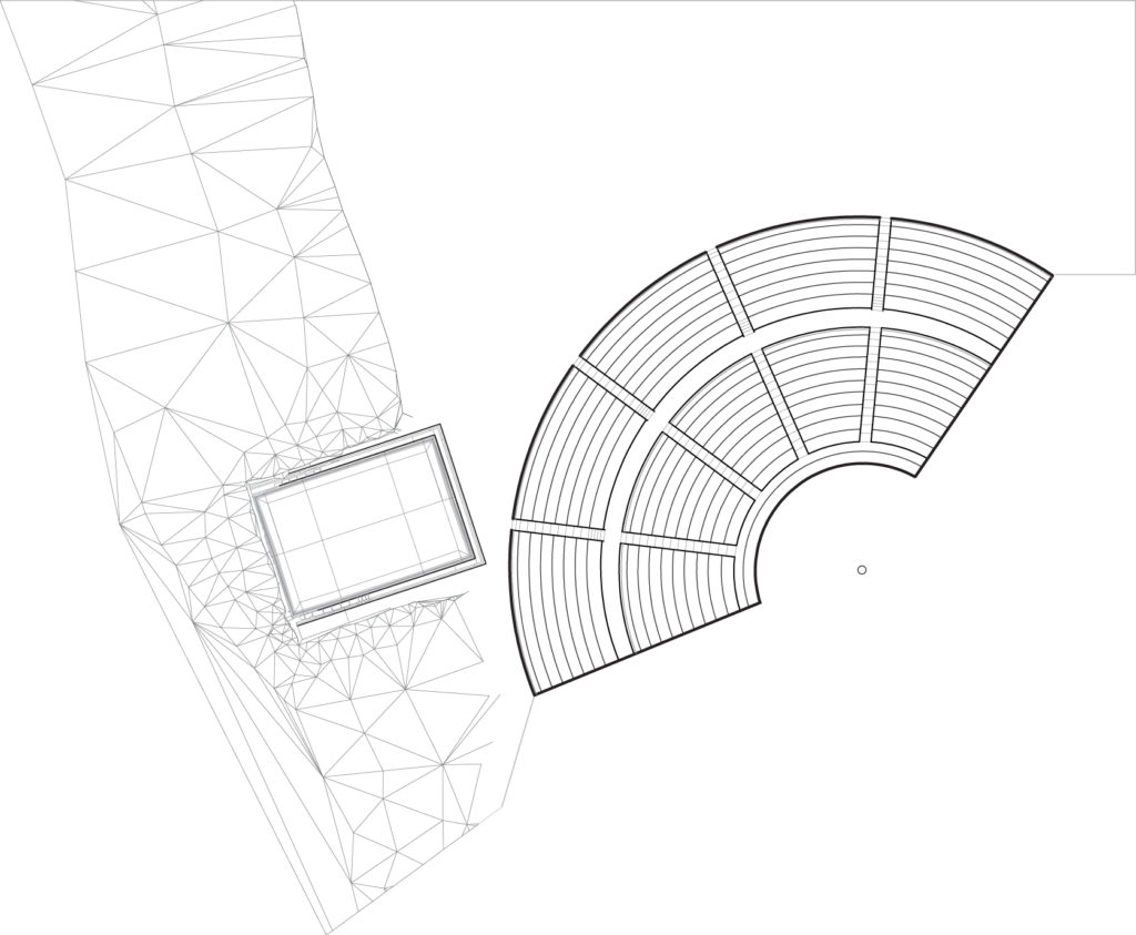
Theater and Nike Precinct Plan
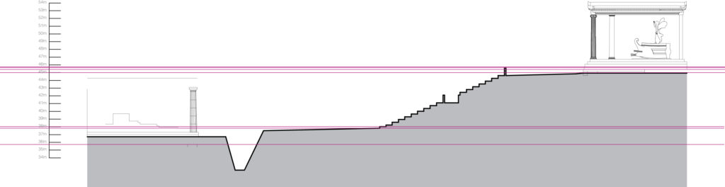
Sectional Relationship between Theater, Nike Precinct, and Altar Court
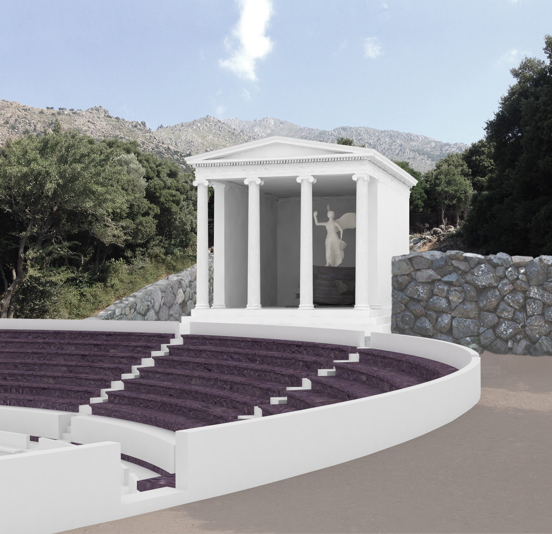
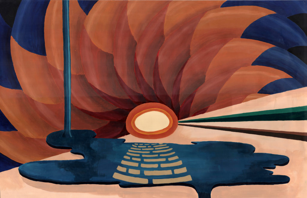
Once the 3D model of the reconstructed theater was complete, the rendering of the Nike precinct was illustrated. The 3D models of the Nike monument and sculpture were passed down to me from previous summers, but were edited for corrections. The stone of the theater seating is porphyry stone, (the Greek word for “purple”). There is some debate as to whether the Nike sculpture was open to the sky (left image) or covered with a roof (right image), so we created renderings of both.
The images were composed with the projected ground level of ancient times with photos of the vegetation from the site, Mount Fengari in the background, and stone walls that delineate the precinct. These images were published in a special issue in March 2015 of the Louvre museum’s “L’Objet d’art” magazine publication, which featured the exhibition “La Victoire de Samothrace.” It has been published numerous times after this debut.
institution: harvard graduate school of design instructor: florian idenburg team members: enoch wong and myself time: spring 2016 project: a joint venture laboratory for corning, Inc. location: corning, new york publication:“work environments: glass works” studio report
In today’s corporate world, strategic partnerships and associations are a necessity. A partnership is created when a shared goal is identified and neither party can efficiently achieve it on their own. Corning, Inc. has a longstanding history of joint ventures and associations with companies in both competing and disparate industries.
The challenge of designing a joint venture laboratory for Corning is the possible combinations of skill sets and degree of shared information. In some joint ventures, the two parties are competitors in the same market and must protect their own intellectual property. In others, the two belong to dissimilar industries and full transparency is mutually beneficial. This new laboratory must be designed to accommodate joint ventures that favor either separation or unification.
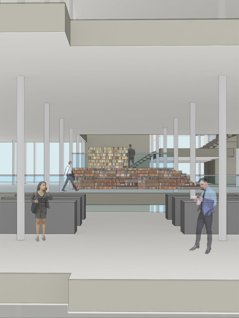
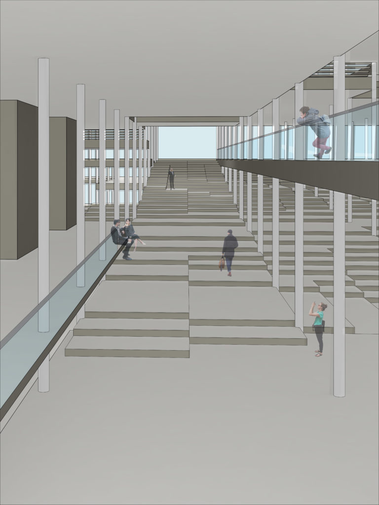
Regardless of the structure of any joint venture scenario, we determined that public program, such as the lobby, cafe, auditorium, library, and gallery were always shared spaces. These spaces create a wandering atrium through the center of the tower/podium massing, acting as both a buffer and transition space between two halves. The boundary between public and private space is deliberately ambiguous. The public space not only physically separates the research spaces of the two halves of a joint venture, but also blends into the private spaces to camouflage itself. This separation is meant to be illegible, creating a stronger sense of unity rather than division.
Conceptual Section of Public Boundary Between Two Halves
institution: harvard graduate school of design instructor: jenny myers time: career discovery / summer 2009 project: foam core assembly to create two implied volumes
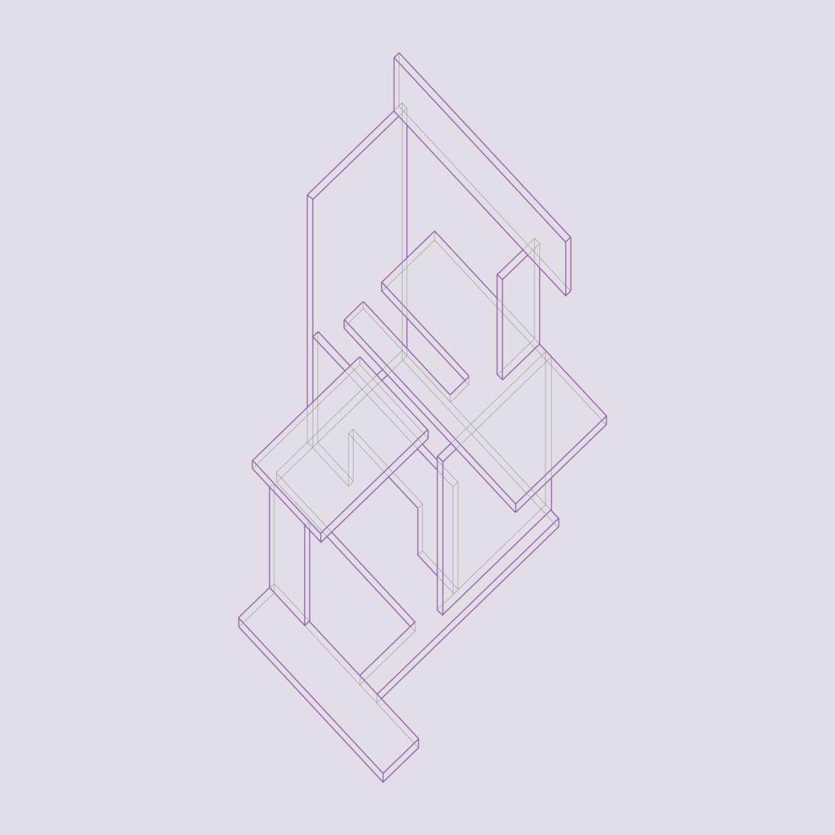
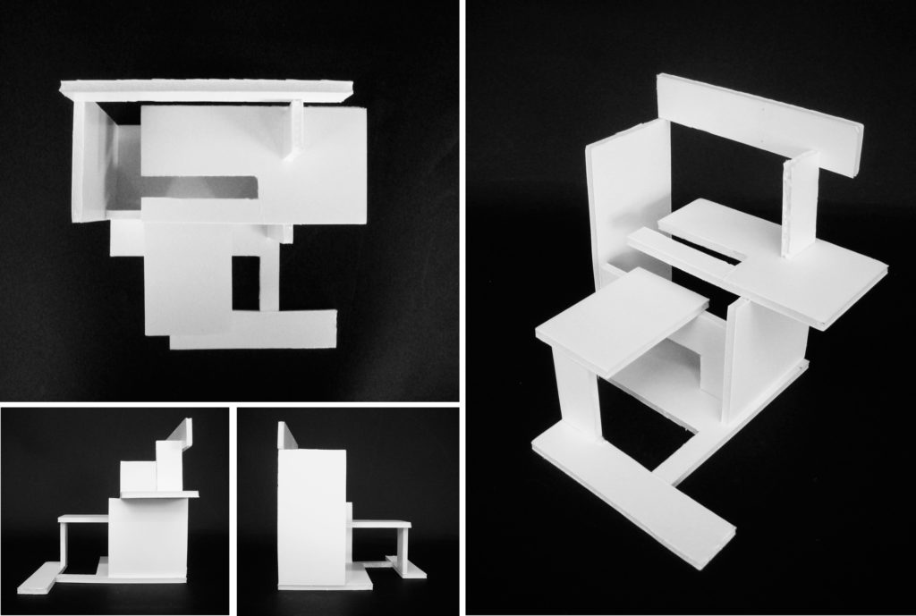
The first assignment of the Career Discovery program was to cut foam core into a prescribed set of subdivisions and assemble them into a 3D volume. This volume must fit within an imagined 6” x 6” x 6” cube, define at least 3 edges of the cube, and contain two distinct spaces defined by at least four planes. This model would be used to create two dimensional, orthographic drawings, all the while mediating on the limitations and successes of each medium.
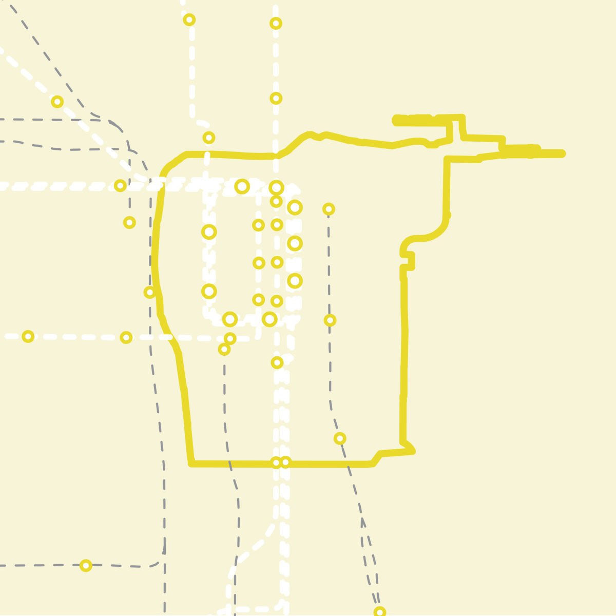
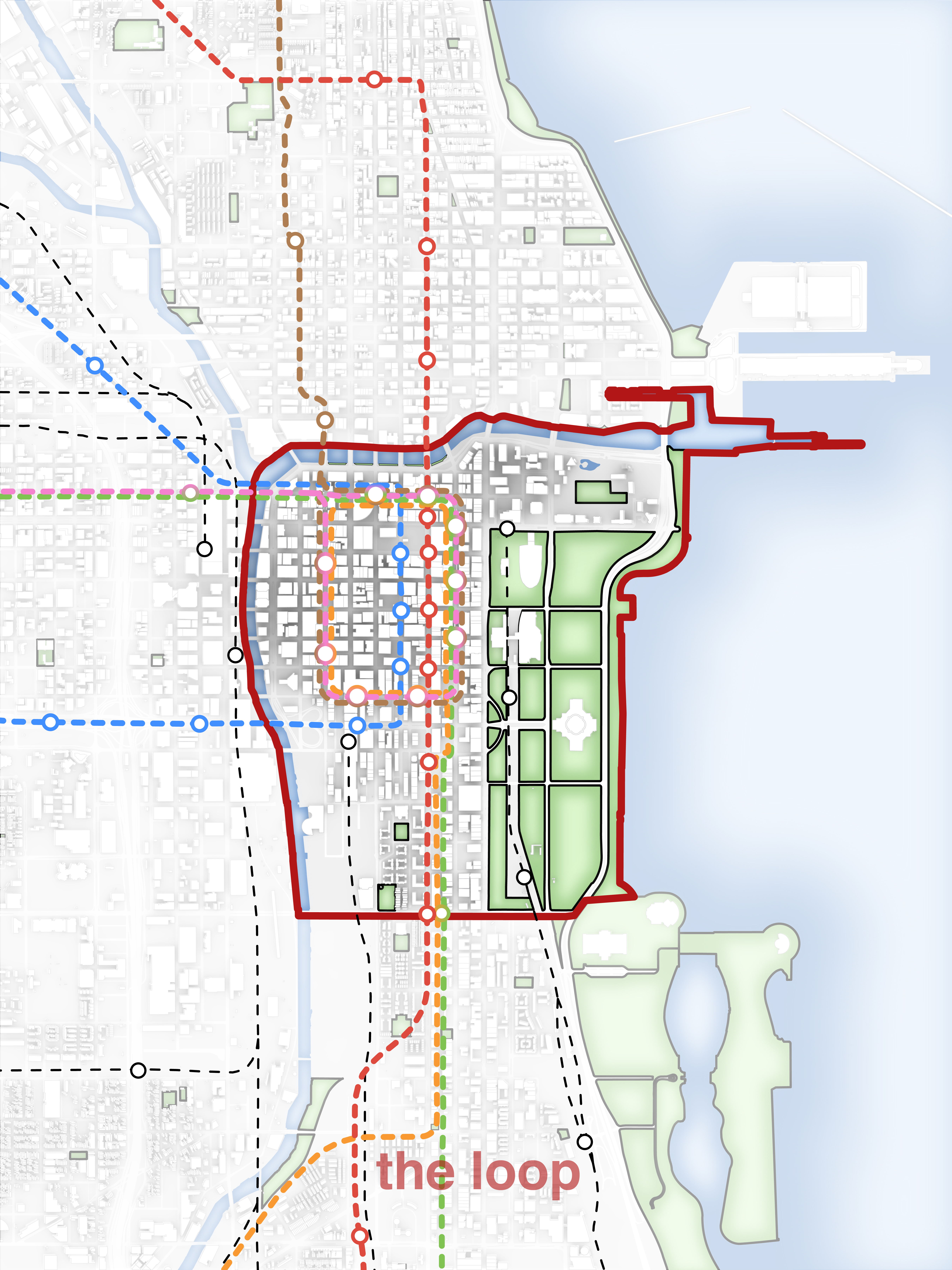
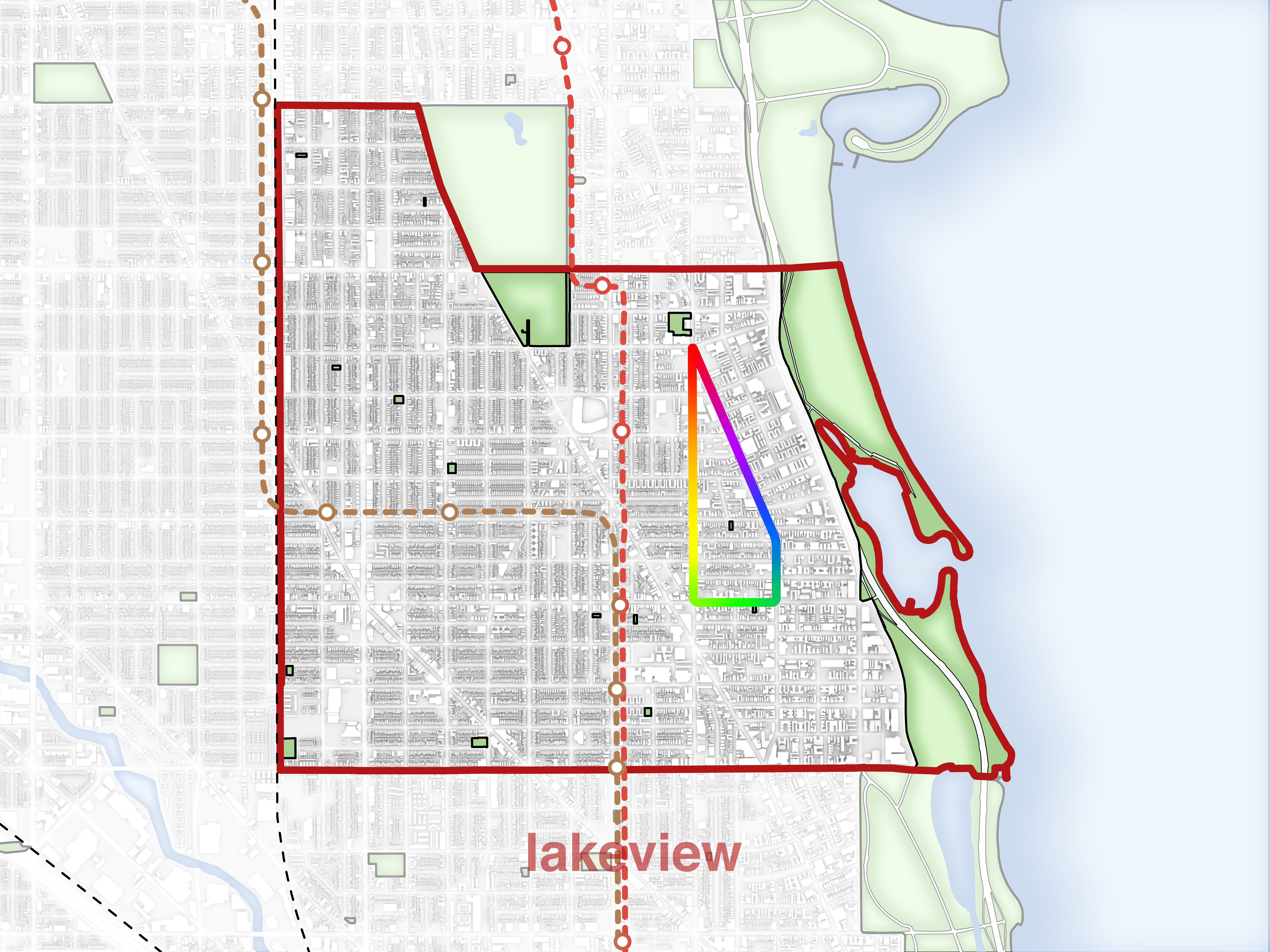
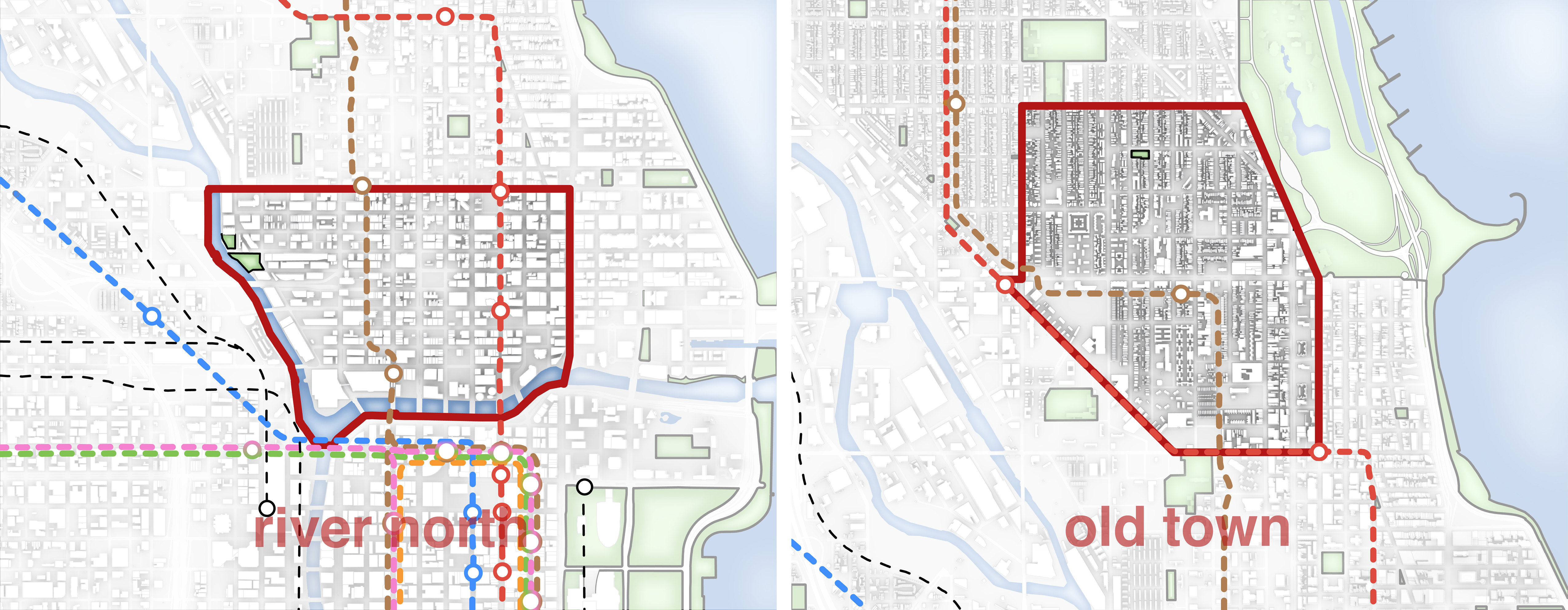
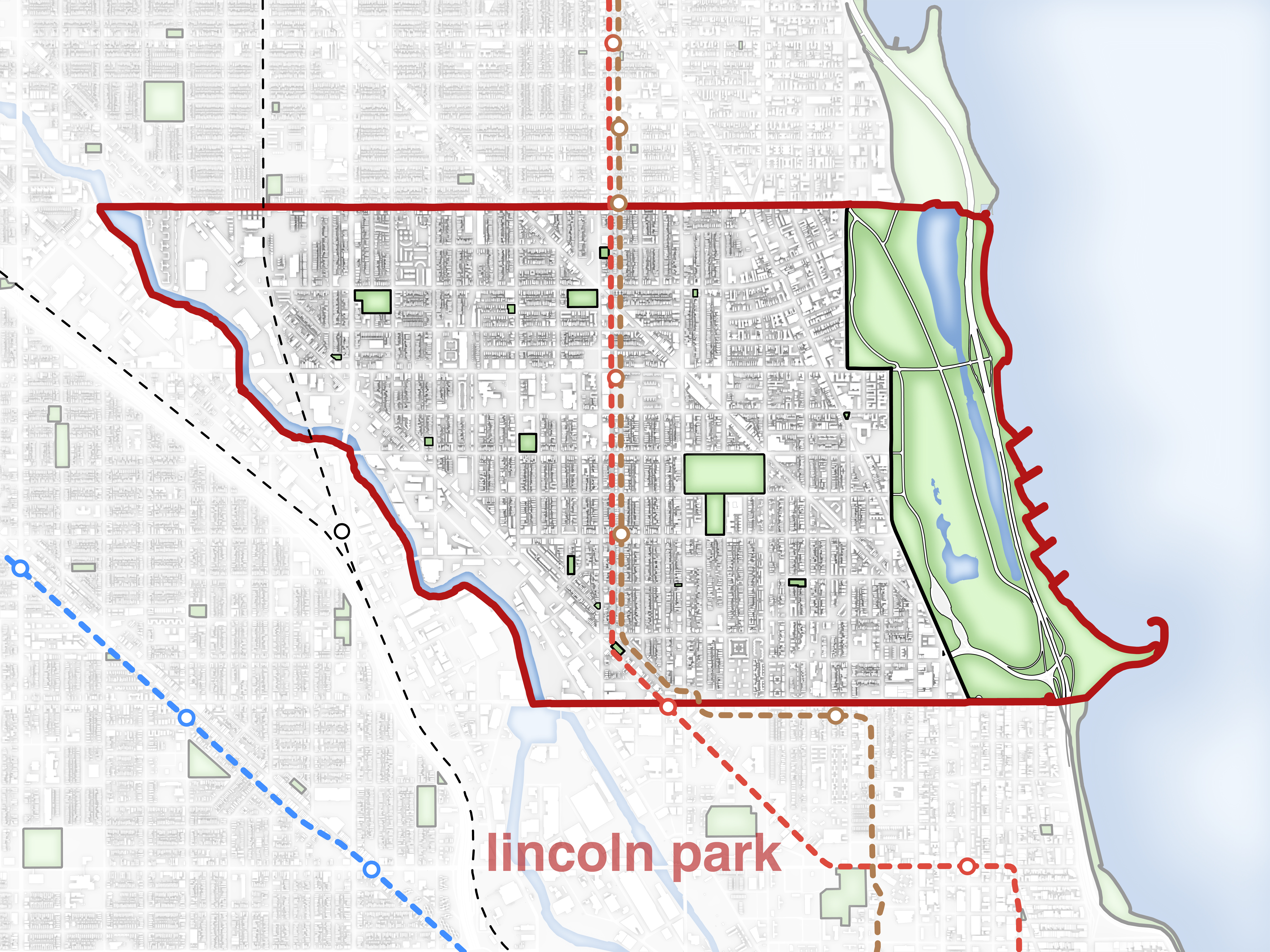
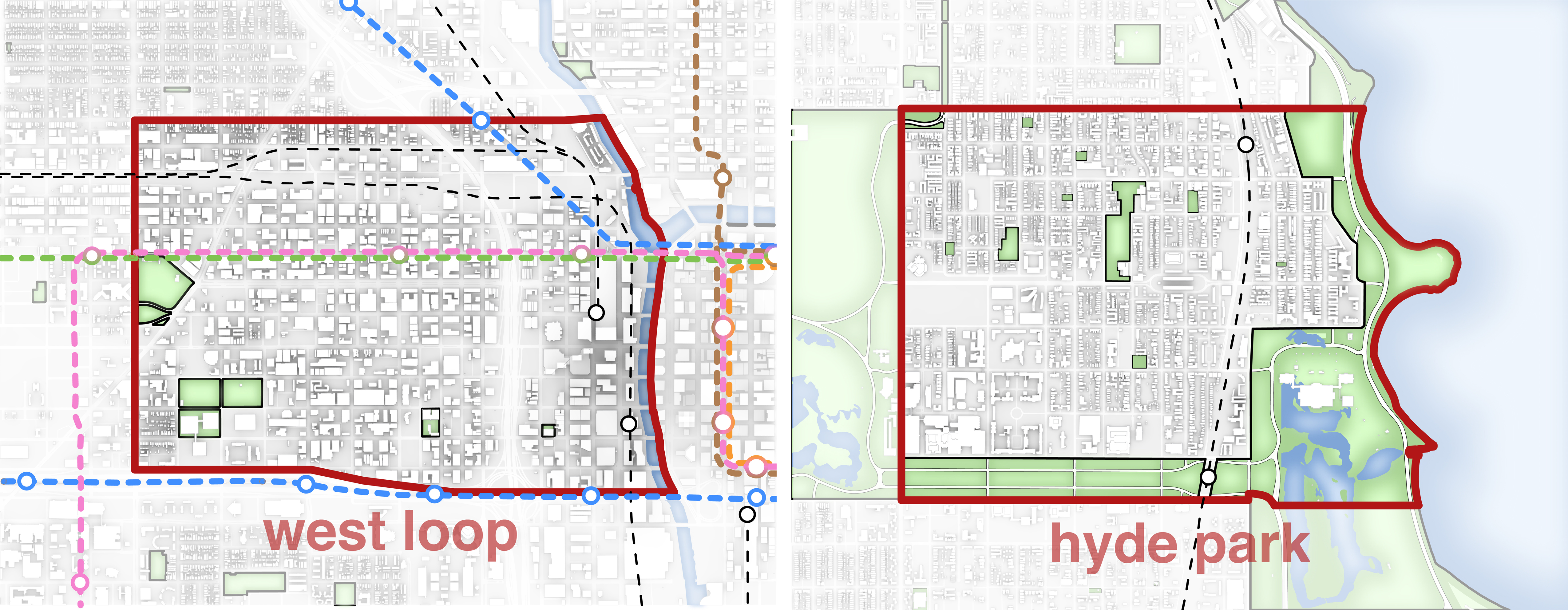
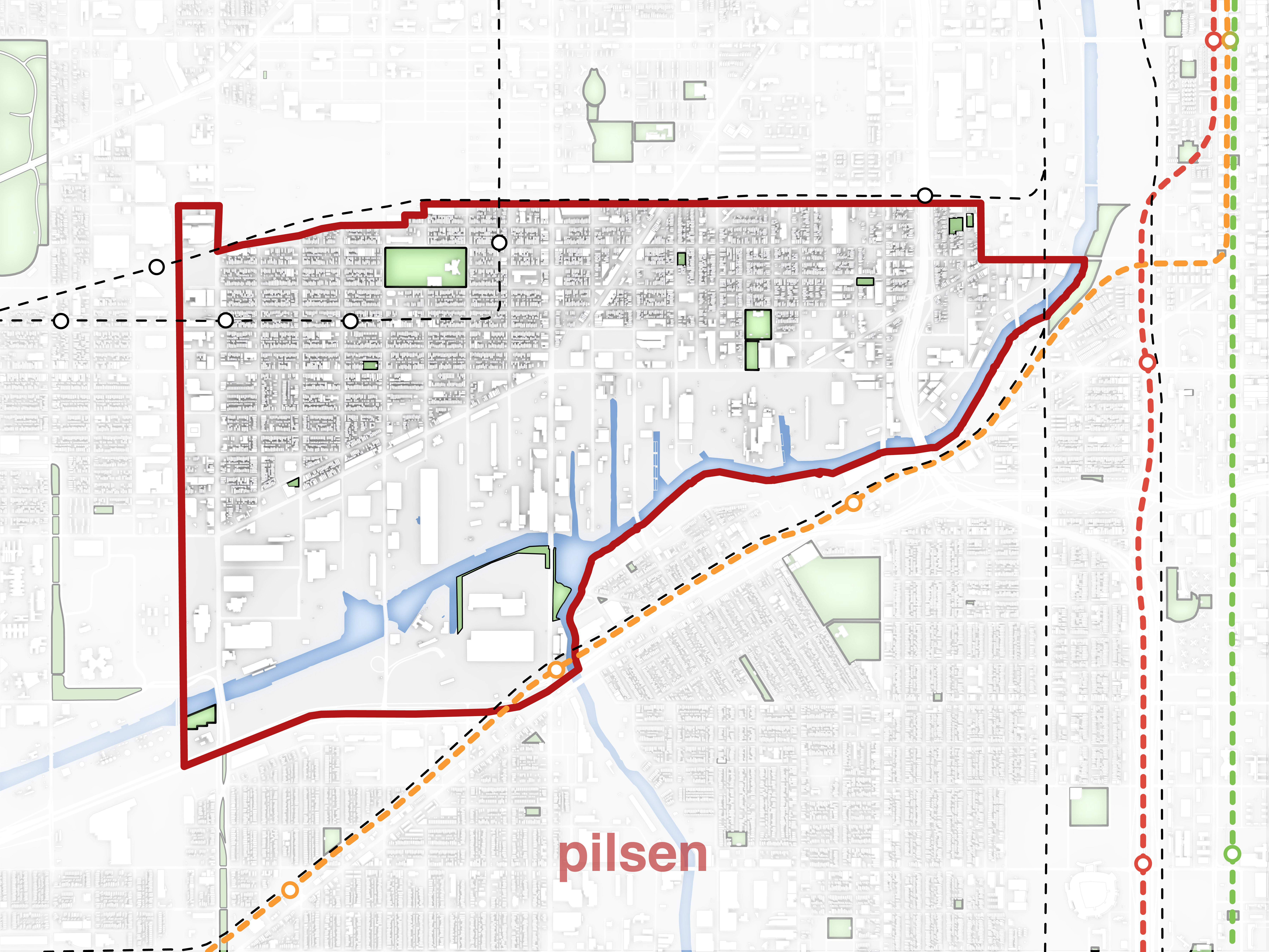
When I first moved to Chicago, I diligently studied my routes to and from different parts of the city so that I could get my bearings. At the same time, my apartment was in desperate need of some artwork to breath a little life into it. I used this as an opportunity to create maps of several Chicago neighborhoods. These wall decorations simultaneously brought color into an austere apartment, and became a tool to better understand the context of this expansive city.
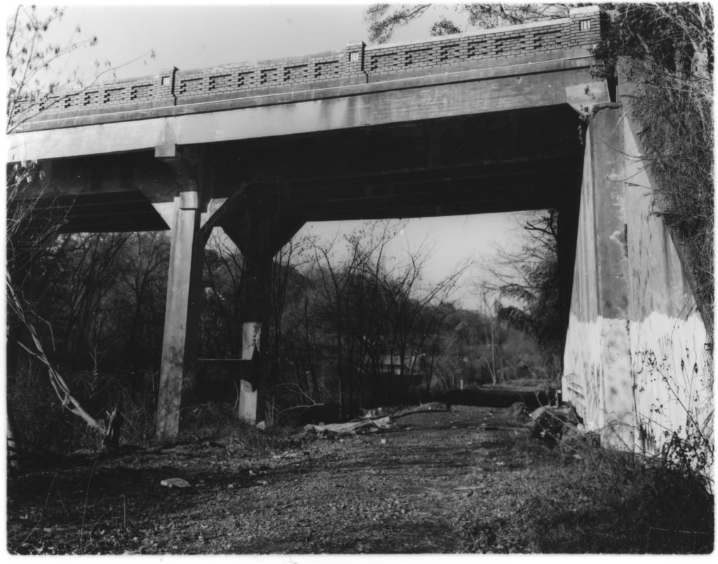
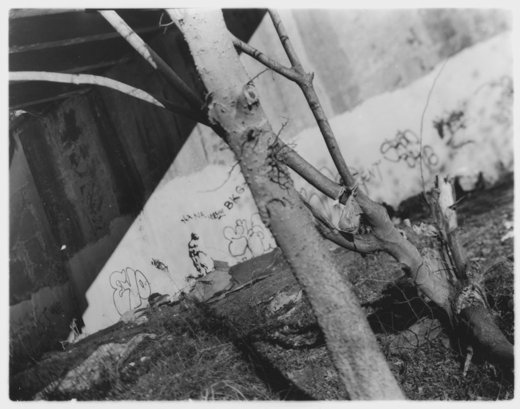
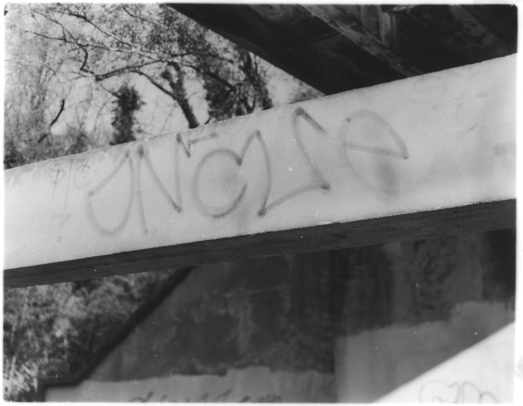
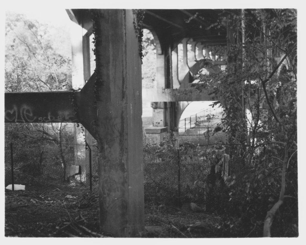
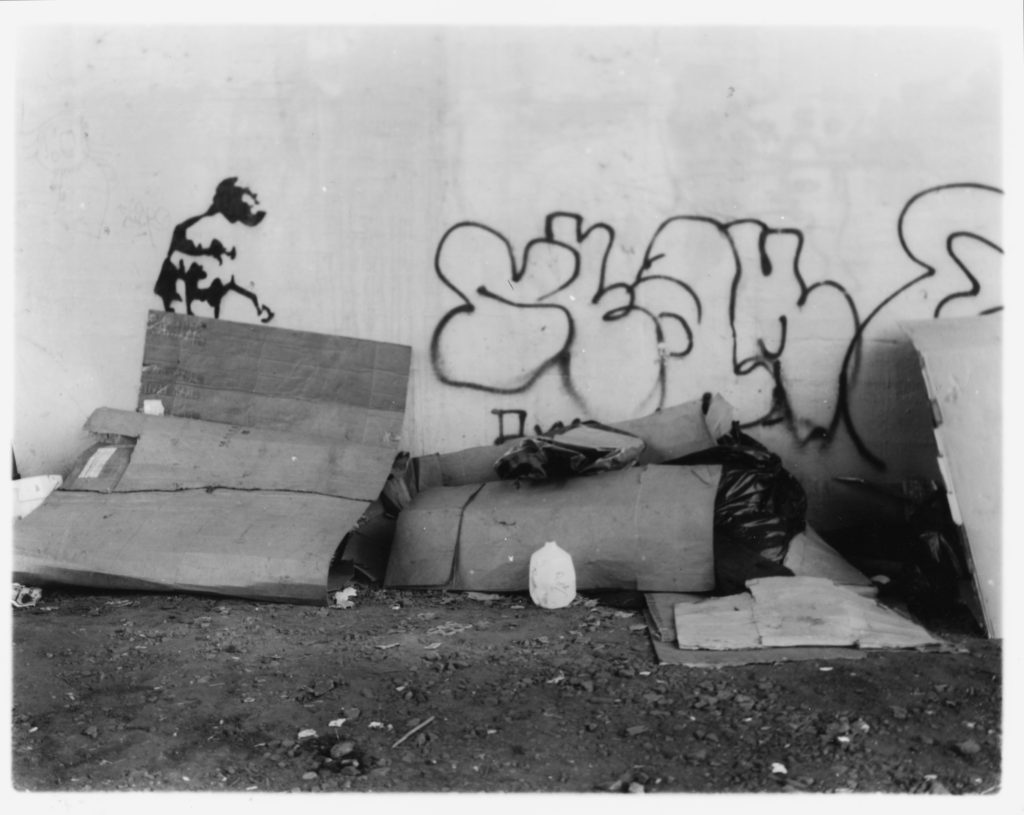
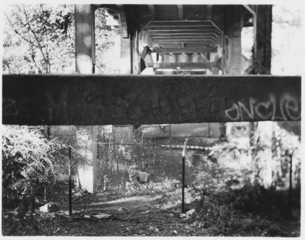
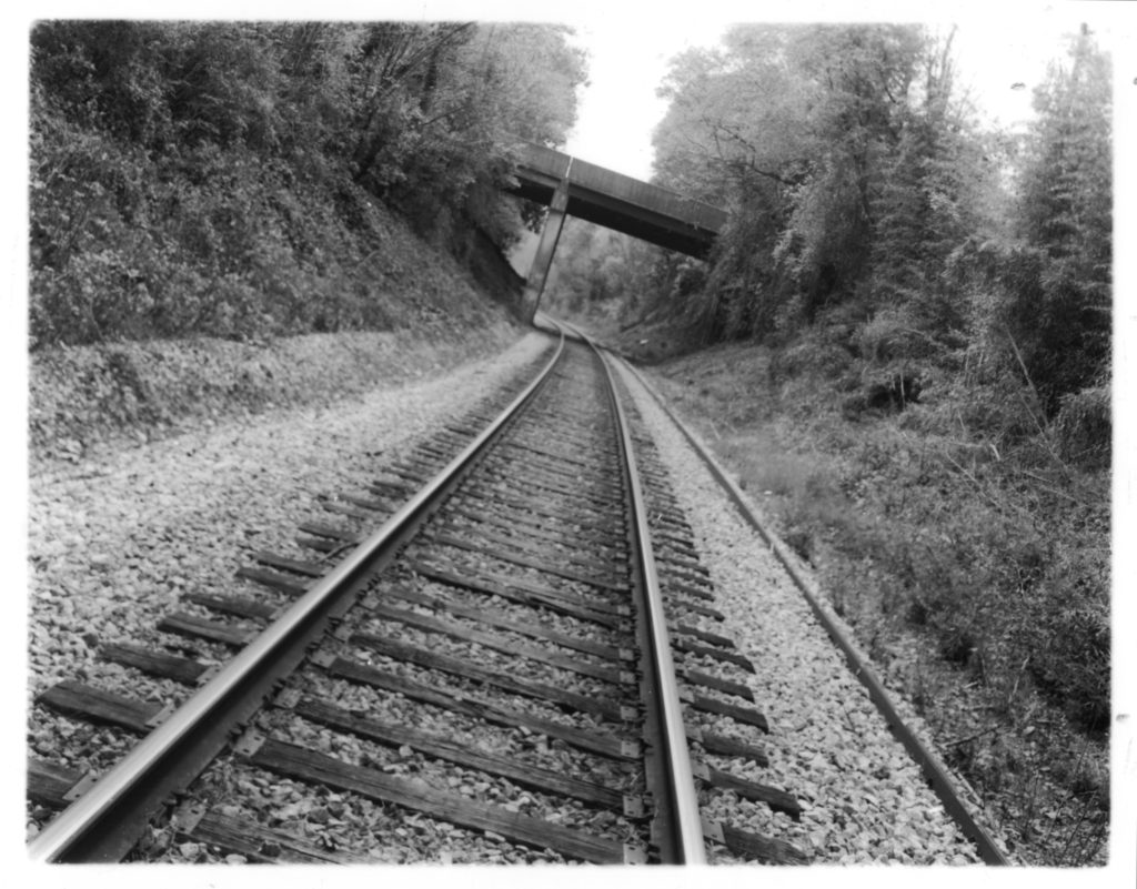
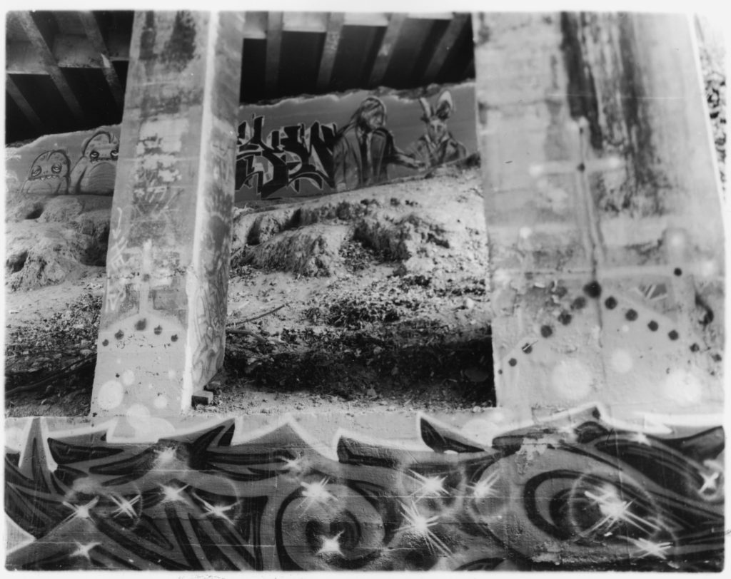
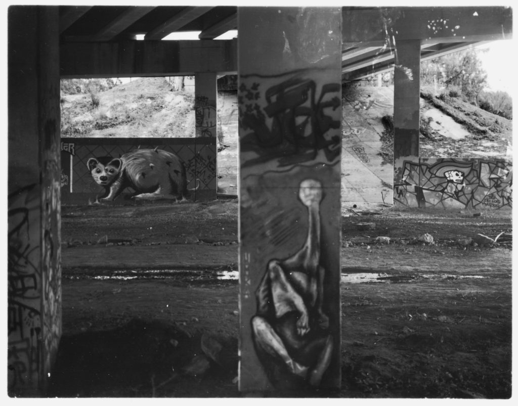
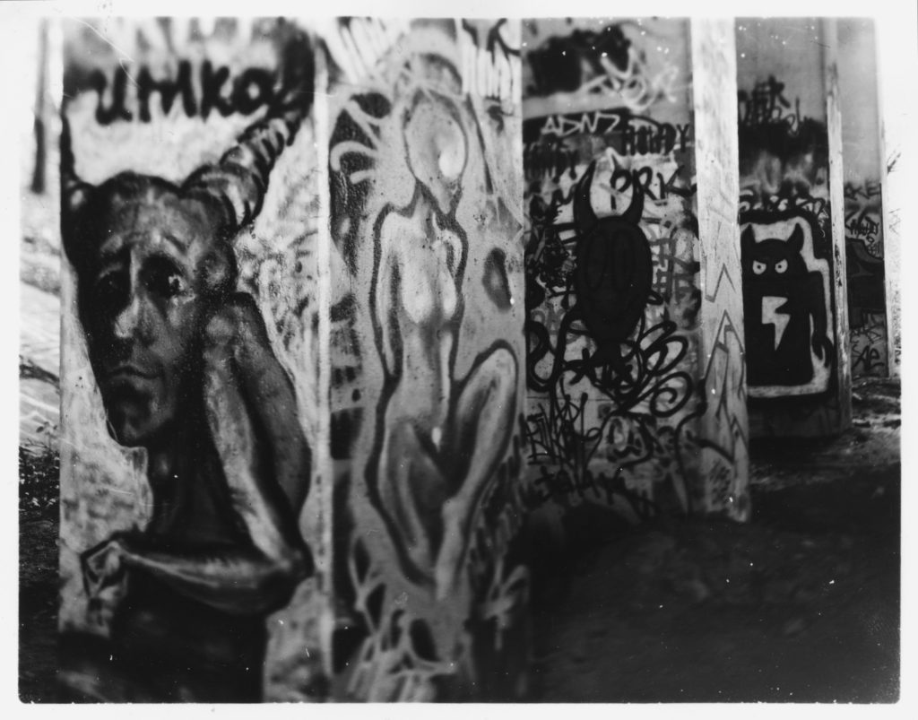
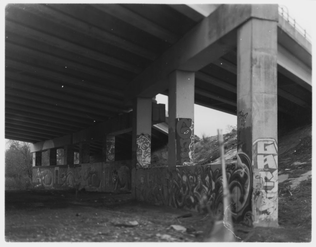
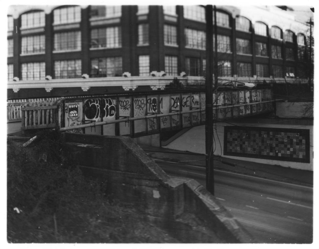
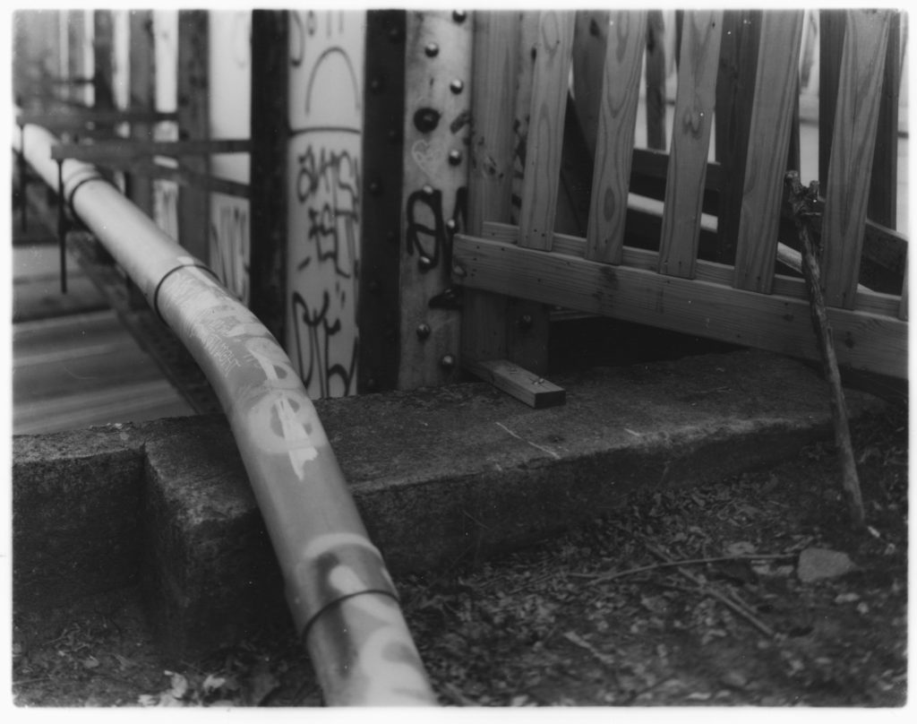
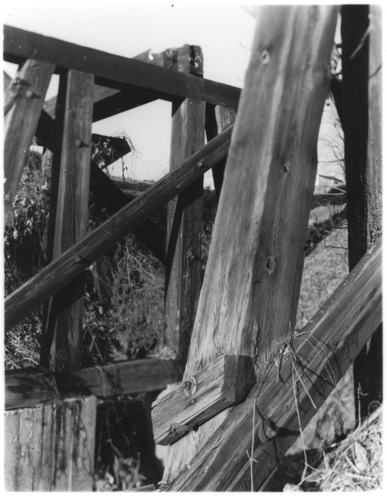
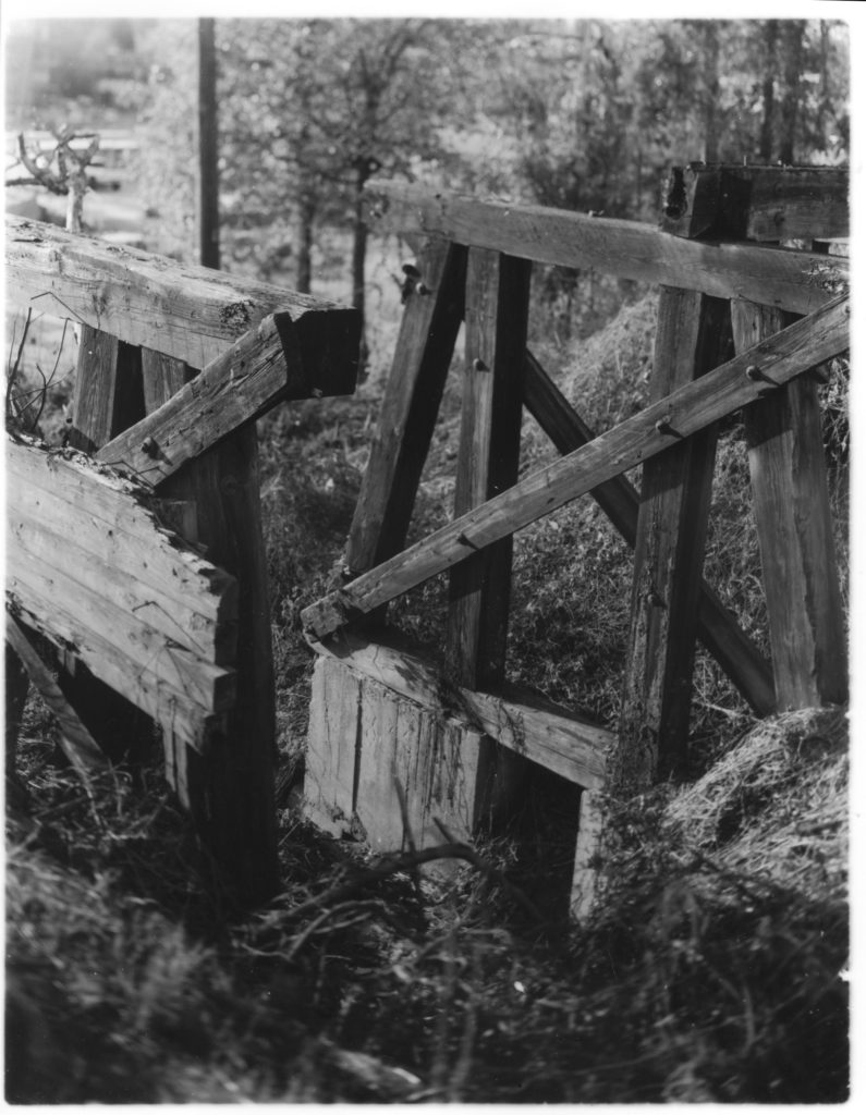
The Beltline, a deserted loop of railroad tracks encircling downtown and midtown Atlanta, once represented the industrial prowess of the burgeoning city. After years of disuse and overgrowth, the tracks became spaces for grafitti artists and vagabonds to gather and take shelter. One ambitious architecture student at Georgia Tech would dramatically change the character and function of these abandoned tracks. The proposal suggested that these tracks could become an urban hiking trail, with adjacent housing projects, public art displays, and improved public transportation. The plan has been set in motion with much development already taking place along the Beltline, and the paths already get much use from joggers and cyclists. These photographs, taken on 4″ x 5″ negatives in a view camera, show a frozen moment in time in the lifespan of the Beltline. Taken during the fall of 2010, the Beltline today is already unrecognizable from these images. At this time, there was an unplanned character given to these spaces by the people who took shelter here and made this space their own.
Premise
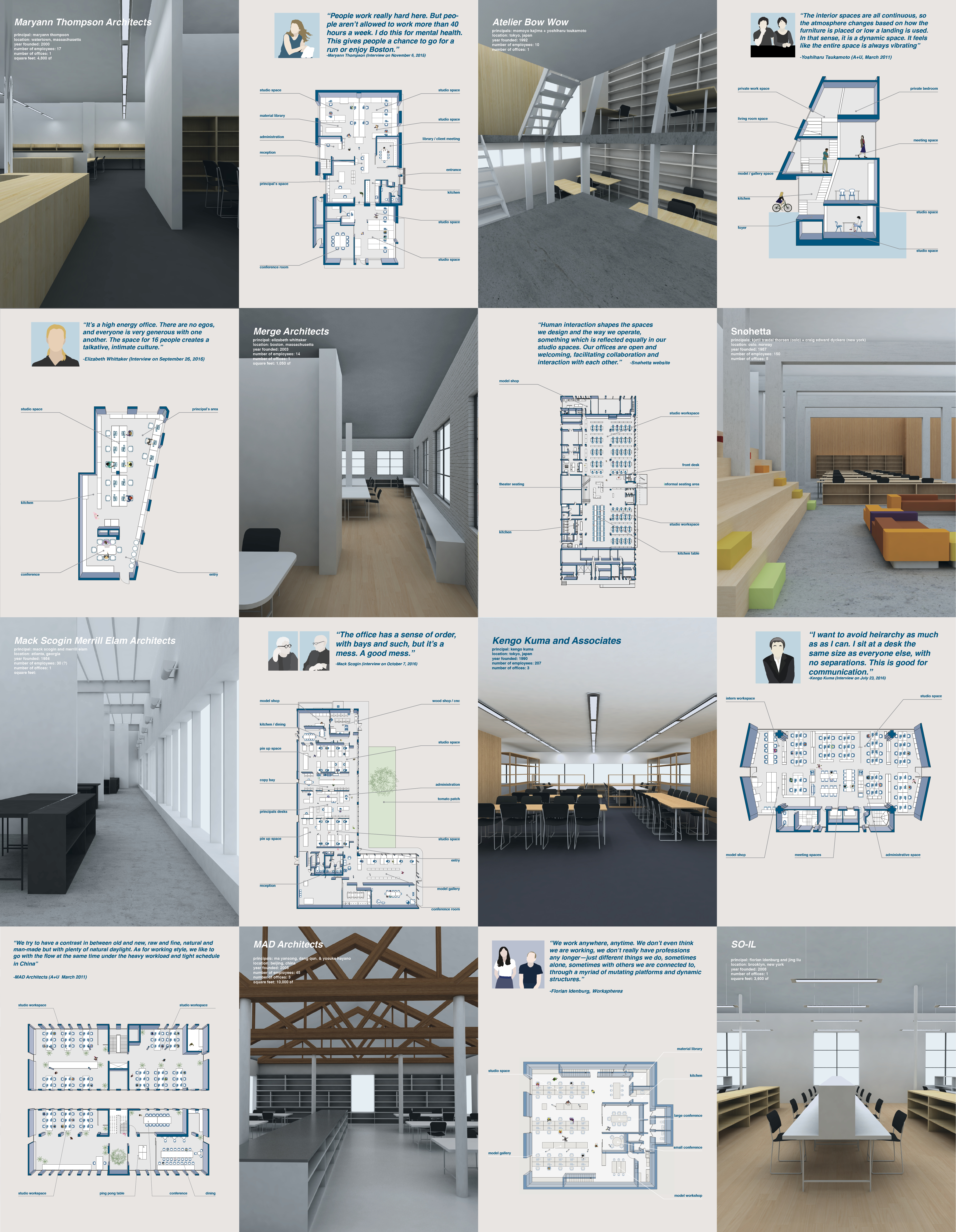
My thesis began with an interest in the spaces of architectural practice, and how the spatial layout and structural hierarchy of architecture firm influences the social culture of the firm. I compiled a series of case studies of architecture firms around the world, and was fortunate enough to interview with some of the principals, to discuss the arrangement and organizational structure of their offices.
Sample of case studies
This initial investigation into the working life of architects led me to a different question. The design profession, with its rich cast of characters and interests, has created its own culture. A longstanding history of all nighters in design school, detail obsession, and high end aesthetic tastes can feel intimidating or difficult for non designers to understand or penetrate. While these differences can be celebrated in a way, we also run the risk of isolating our profession in the eyes of the public.
What could be done to foster discussion, interaction, understanding, and trust between designers and those for whom we design?
I see this is as a moment to break open the architecture profession, letting in inspiration and dialogue from our surroundings while also sharing our culture with others, creating a fluid network of exchange both in and out of the profession.
This thesis proposes a new space, an architecture design center, that integrates public spaces, education spaces, making spaces, and the spaces of architecture practice. More so than a standard mixed use buildings of adjacent but not necessarily codependent programs, The functions of the public spaces and the architecture firm are woven into one another and eschew boundaries. It’s an architecture firm that is a public destination whose designers are also contributing members to the dissemination of design knowledge.
Site The chosen city is Cambridge, Massachusetts, for several reasons:
1: The greater Boston area is consistently ranked great for best cities with families, best for singles, best cities for empty nesters, best cities for retirees, and best cities for members of the LGBT community. 2: Established architectural design network (Harvard, MIT, Northeastern, etc.) 3: The walkability / bikeability / access to outdoor physical activities (pool, bike trails, parks, etc.)
The particular site in Cambridge is an empty lot in Cambridgeport, which falls at the threshold of commercial and residential spaces and is therefore a symbolic blending of work and life.
The site’s proximity to an elementary school, commercial buildings, scenic walking paths, recreational fields, and design schools show opportunity to join the existing networks but also potential to add more, such as infant care, indoor workout spaces, a Hubway bike station, and more.
Site plan
Program Public programs such as a daycare, a gym, an exhibition space, a fabrication lab, a yoga studio, and a cafe into the spaces of architectural practice. This not only serve as an opportunity for the designers in the firm to more efficiently maintain a work/life balance but also to share resources with like-minded individuals.
However, cohabitation does not guarantee interaction. In order to encourage dialogue and exchange, the given programmatic typologies of a gym / firm / cafe / daycare are broken down and recategorized by function, such as working, eating, learning, exercising, and relaxing.
The spaces are then reconfigured into zones organized by function. The users then inhabit the spaces on equal terms with a shared objective. This creates spaces of common ground, between people of any profession or age who happen to share similar motivations. To better integrate designers and non-designers, the space is used in an educational capacity. The architects can teach public courses in the computer lab on graphic design software or 3D modeling. The fab lab can be used for after school programs in model making, food grown on the roof garden can be sold and eaten inside, the theater space can hold community events perhaps unrelated to architecture, or conversely host dialogues in architecture that the neighborhood is invited to.
The organizational strategy of these functional zones is to create visual connections and easy access across functional boundaries. The working zone is configured as a loop, creating a non hierarchical layout. Half of this loop is raised to create an opening underneath into more publicly inviting spaces, such as the eating and learning zones, which then fill in the center of the working loop. The exercise zone hangs above and is easily accessed from the working and learning zones. The relaxing zone sits upon the roof, with access to a roof meditation garden and a massage center.
Organization The working zone is configured as a loop, an inherently non-hierarchical shape without a beginning or an end, will create a hollow center to be readily accessible from many points from public spaces that will fill the interior. This loop is staggered in section to create not only public space in the center of it, but also above and below. The learning zones, a combination of the gallery, bookstore, computer lab, fab lab, daycare, and public theater seating, also staggers in section to strategically align certain components of its program with the adjacent zones. For example, the computer lab, when the designers can offer courses on graphic design and basic architecture software, finds itself in a buffer between the learning and the working zones. The fab lab as well. The eating zone, and open place for gathering, situates itself at the center of the plan and section. Hovering above it all is an exercise zone for yoga, cardio, and weight lifting. A soaring figure eight running track hovers above the spaces below so as to be a visual connection between fitness and working. At the top, more secluded from the other zones, is the relaxing zone for massages, changing rooms, and a meditative zen garden. A public community garden finds itself on the roof as well.
On the site, the shape of the property line made for a difficult use of a column grid, as one side is much narrower than the other. To work within this constraint, a kinked grid was utilized, giving structure and logic to the open space within. Visual connections, openness, and blurred boundaries were a top priority goal, so enclosures are kept to a minimum but definitely used to add variety to such an open space, such as closed off conference rooms for privacy or a gently partitioned gallery.
Basement and Ground level plans
Second and Third Level Plans
Fourth and roof level plans
Sections
Final Model Photos
Impact This center would increase exposure of the design profession and, in turn, foster a culture of inclusion for whom we design. Establishing new relationships and breaking out of the architecture echo chamber would better equip designers to proactively engage in their context and simultaneously better equip the public to contribute in architectural dialogue. This new center will interject architecture design into the daily lives of the people who live, work, or play nearby. It will serve as a testament to the design work done on the inside: a physical manifestation of the mission statement of the architecture firm.
What this project hopes to achieve is spreading, through education and shared interests, certain facets of what we do as architectural professionals through shared interests. It humanizes the profession. We would be constantly reminded of the benefits of a more reasonable work life balance, and put our design thinking minds into perspective and context. The transparency it would add would make our design culture more inclusive and perhaps relatable, and even better it would educate and expose more people to it.
institution: harvard graduate school of design course: mapping: geographic representation and speculation instructor: robert pietrusko team members: anita helfrich, niki murata, and myself time: spring 2016 project: physical map of noise levels recorded in a 24 hour period awards: nominated for and featured in platform 9 and the GSD home page
The students in the class were tasked with mapping a daily journey in the Boston area using tracking apps with our phones, and recording checkpoints and data of the surrounding environment. Our team shared a desire to map intangible variables removed from a standard cartographic projection. Using a three dimensional medium for representation, it was important that our model have legible data in plan, section, and elevation. As a point of departure, we used the five noise levels (very low, low, medium, high, very high) and decided to map out their magnitudes over the course of a 24 hour period. In order to do this, we collected the data recorded of the noise levels and plotted them on an (x,y,z) graph. The x-axis marks the 24 hours in a day, the y-axis marks the five noise levels, and the z-axis is the magnitude or number of checkpoints recorded.
The resulting collection of plots is a contoured topography showing levels of noise over the course of the day. The sectional contours show the fluctuating swing of magnitude and noise levels across the day, while the pixels create a “heat map” in plan view showing the average number of way points recorded in five intervals.
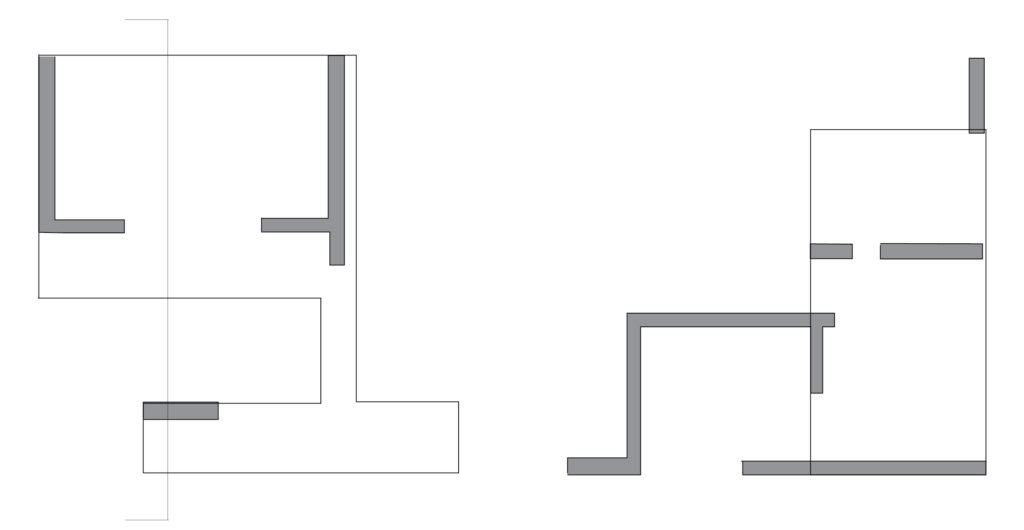
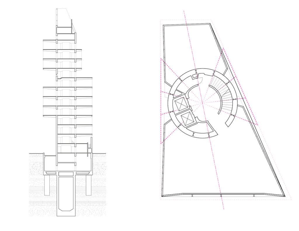
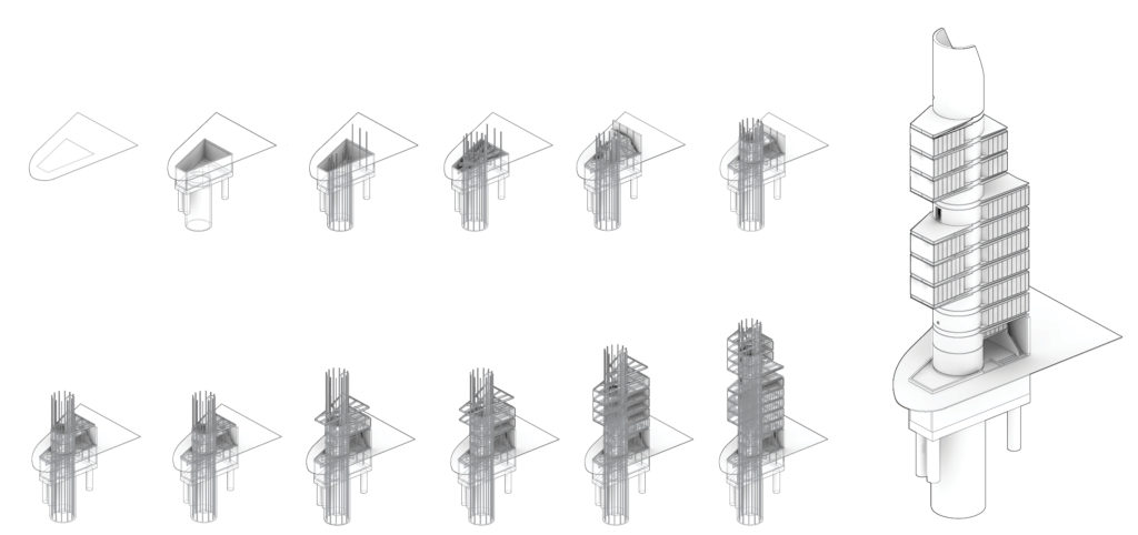
institution: harvard graduate school of design course: innovative construction in japan instructor: mark mulligan team members:johanna faust, justin jiang, felipe oropeza, and myself time:spring 2015 project:model, analysis, and representation of kenzo tange’s shizuoka press center location: tokyo, japan
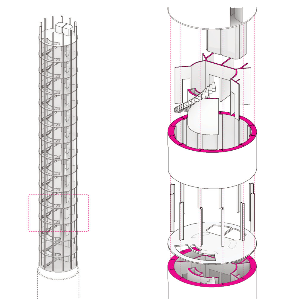
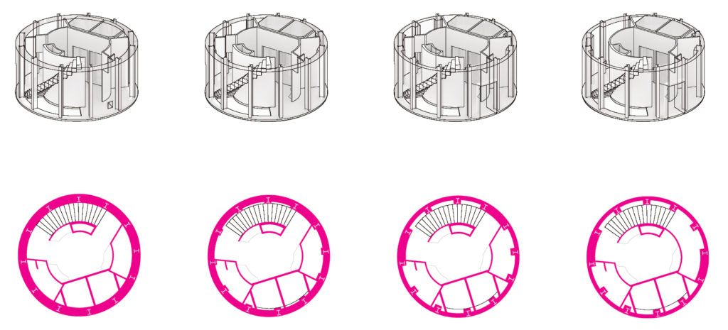
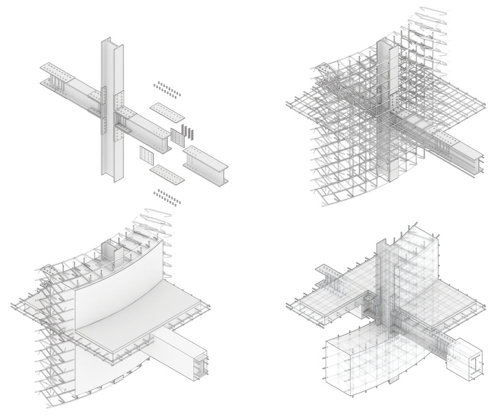
The Harvard GSD is home to the Kenzo Tange Archive, a collection of original drawings from Tange’s work. Our group chose the Shizuoka Press Center, a still extant building located in the Ginza district of Tokyo. As a group of four, we built a 3D model of the project from its original construction drawings. This exercise gave insight into the structural concepts of the project, including tapering cantilevers that “plug into” the structural core as was common in the Metabolism movement in 1960s Japan. We also discovered a large false cantilever at the back, which gives the illusion of a massive cantilever but belies the column supports within.
section and plan (credit to johanna faust)
construction sequence
core structure (credit to Justin Jiang)
core thickness in plan (credit to Justin Jiang)
steel connections and concrete (credit to Felipe Oropeza)