institution: harvard graduate school of design
course: mapping: geographic representation and speculation
instructor: robert pietrusko
team members: anita helfrich, niki murata, and myself
time: spring 2016
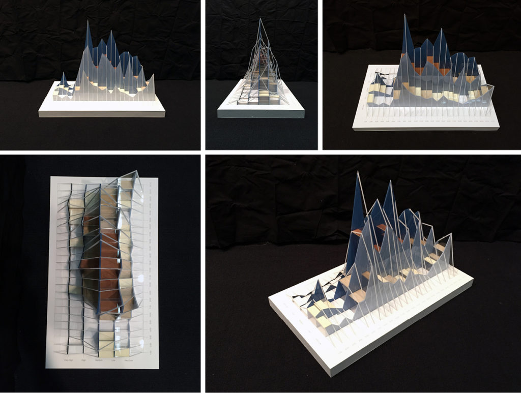
project: physical map of noise levels recorded in a 24 hour period
awards: nominated for and featured in platform 9 and the GSD home page
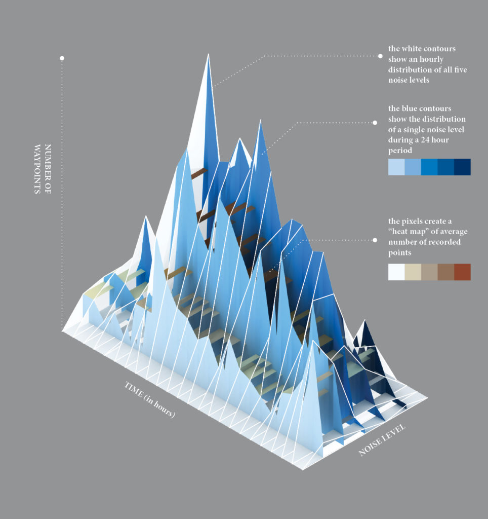
The students in the class were tasked with mapping a daily journey in the Boston area using tracking apps with our phones, and recording checkpoints and data of the surrounding environment. Our team shared a desire to map intangible variables removed from a standard cartographic projection. Using a three dimensional medium for representation, it was important that our model have legible data in plan, section, and elevation. As a point of departure, we used the five noise levels (very low, low, medium, high, very high) and decided to map out their magnitudes over the course of a 24 hour period. In order to do this, we collected the data recorded of the noise levels and plotted them on an (x,y,z) graph. The x-axis marks the 24 hours in a day, the y-axis marks the five noise levels, and the z-axis is the magnitude or number of checkpoints recorded.
The resulting collection of plots is a contoured topography showing levels of noise over the course of the day. The sectional contours show the fluctuating swing of magnitude and noise levels across the day, while the pixels create a “heat map” in plan view showing the average number of way points recorded in five intervals.