Premise
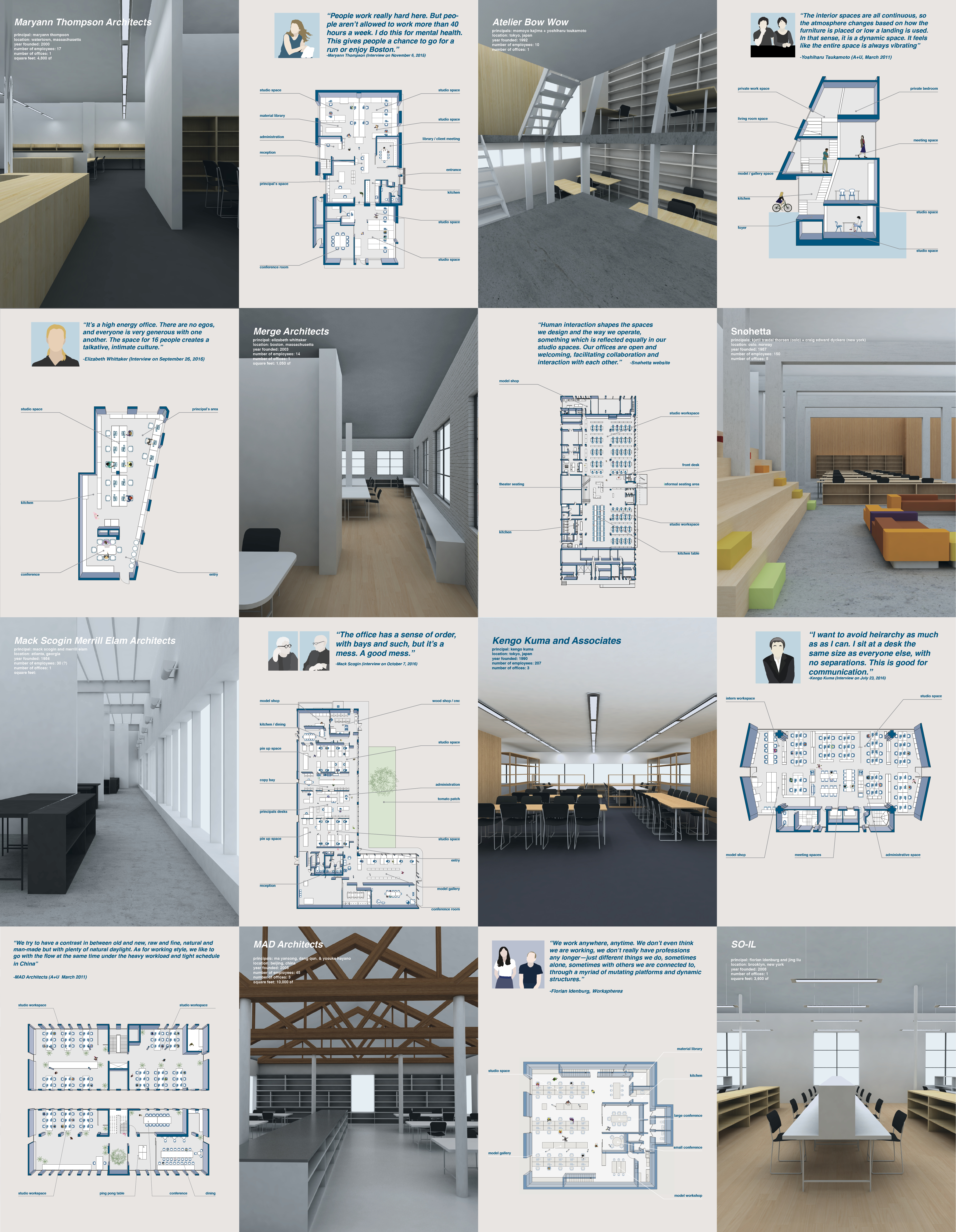
My thesis began with an interest in the spaces of architectural practice, and how the spatial layout and structural hierarchy of architecture firm influences the social culture of the firm. I compiled a series of case studies of architecture firms around the world, and was fortunate enough to interview with some of the principals, to discuss the arrangement and organizational structure of their offices.
This initial investigation into the working life of architects led me to a different question. The design profession, with its rich cast of characters and interests, has created its own culture. A longstanding history of all nighters in design school, detail obsession, and high end aesthetic tastes can feel intimidating or difficult for non designers to understand or penetrate. While these differences can be celebrated in a way, we also run the risk of isolating our profession in the eyes of the public.
What could be done to foster discussion, interaction, understanding, and trust between designers and those for whom we design?
I see this is as a moment to break open the architecture profession, letting in inspiration and dialogue from our surroundings while also sharing our culture with others, creating a fluid network of exchange both in and out of the profession.
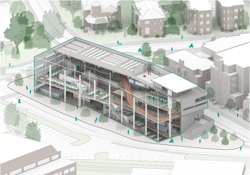
This thesis proposes a new space, an architecture design center, that integrates public spaces, education spaces, making spaces, and the spaces of architecture practice. More so than a standard mixed use buildings of adjacent but not necessarily codependent programs, The functions of the public spaces and the architecture firm are woven into one another and eschew boundaries. It’s an architecture firm that is a public destination whose designers are also contributing members to the dissemination of design knowledge.
Site
The chosen city is Cambridge, Massachusetts, for several reasons:
1: The greater Boston area is consistently ranked great for best cities with families, best for singles, best cities for empty nesters, best cities for retirees, and best cities for members of the LGBT community.
2: Established architectural design network (Harvard, MIT, Northeastern, etc.)
3: The walkability / bikeability / access to outdoor physical activities (pool, bike trails, parks, etc.)
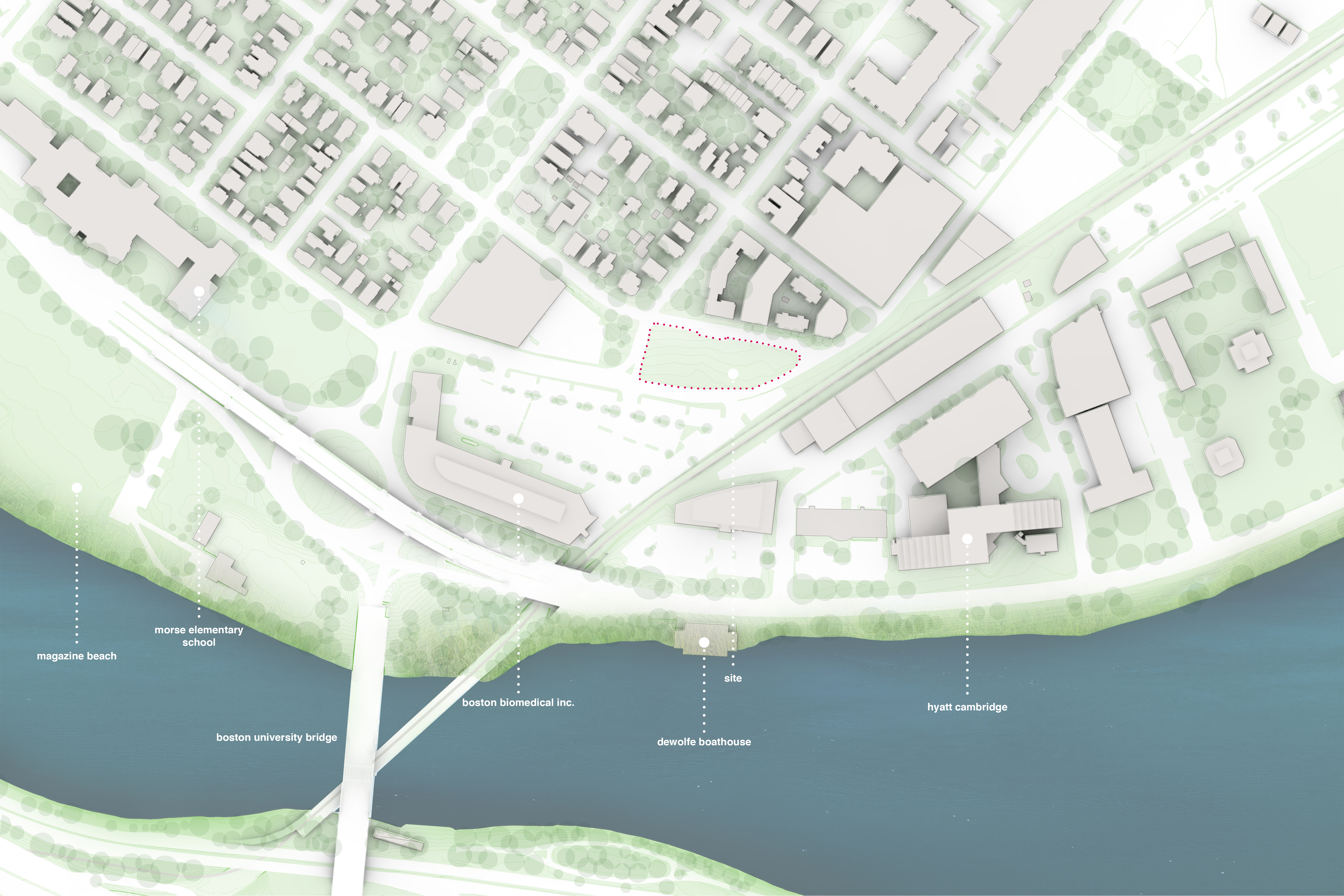
The particular site in Cambridge is an empty lot in Cambridgeport, which falls at the threshold of commercial and residential spaces and is therefore a symbolic blending of work and life.
The site’s proximity to an elementary school, commercial buildings, scenic walking paths, recreational fields, and design schools show opportunity to join the existing networks but also potential to add more, such as infant care, indoor workout spaces, a Hubway bike station, and more.
Program
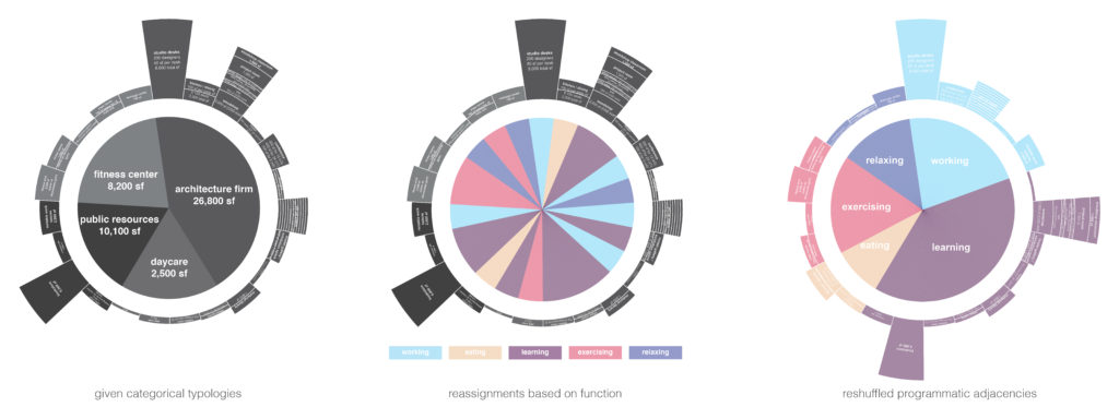
Public programs such as a daycare, a gym, an exhibition space, a fabrication lab, a yoga studio, and a cafe into the spaces of architectural practice. This not only serve as an opportunity for the designers in the firm to more efficiently maintain a work/life balance but also to share resources with like-minded individuals.
However, cohabitation does not guarantee interaction. In order to encourage dialogue and exchange, the given programmatic typologies of a gym / firm / cafe / daycare are broken down and recategorized by function, such as working, eating, learning, exercising, and relaxing.
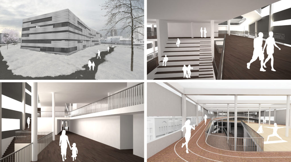
The spaces are then reconfigured into zones organized by function. The users then inhabit the spaces on equal terms with a shared objective. This creates spaces of common ground, between people of any profession or age who happen to share similar motivations. To better integrate designers and non-designers, the space is used in an educational capacity. The architects can teach public courses in the computer lab on graphic design software or 3D modeling. The fab lab can be used for after school programs in model making, food grown on the roof garden can be sold and eaten inside, the theater space can hold community events perhaps unrelated to architecture, or conversely host dialogues in architecture that the neighborhood is invited to.
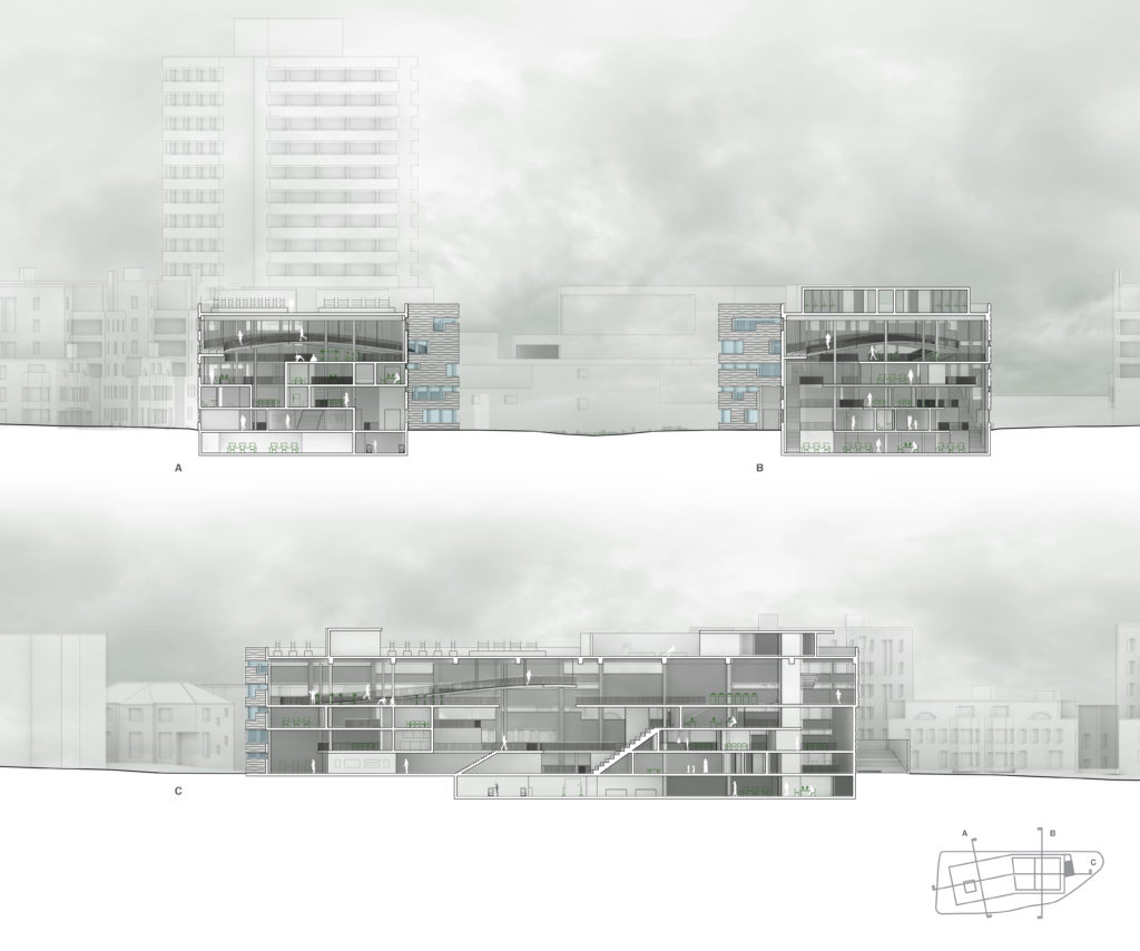
The organizational strategy of these functional zones is to create visual connections and easy access across functional boundaries. The working zone is configured as a loop, creating a non hierarchical layout. Half of this loop is raised to create an opening underneath into more publicly inviting spaces, such as the eating and learning zones, which then fill in the center of the working loop. The exercise zone hangs above and is easily accessed from the working and learning zones. The relaxing zone sits upon the roof, with access to a roof meditation garden and a massage center.
Organization
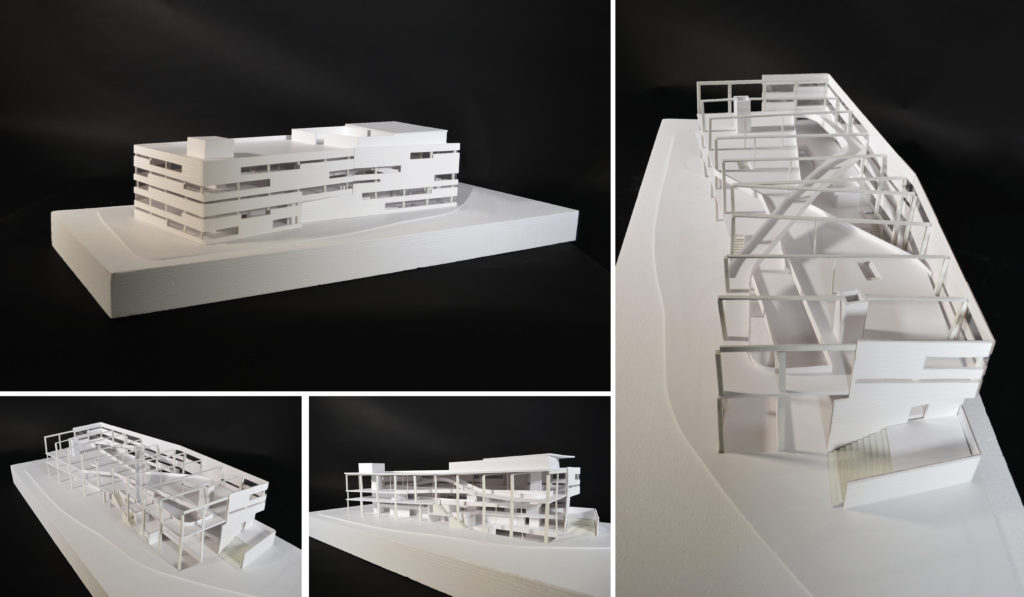
The working zone is configured as a loop, an inherently non-hierarchical shape without a beginning or an end, will create a hollow center to be readily accessible from many points from public spaces that will fill the interior. This loop is staggered in section to create not only public space in the center of it, but also above and below. The learning zones, a combination of the gallery, bookstore, computer lab, fab lab, daycare, and public theater seating, also staggers in section to strategically align certain components of its program with the adjacent zones. For example, the computer lab, when the designers can offer courses on graphic design and basic architecture software, finds itself in a buffer between the learning and the working zones. The fab lab as well. The eating zone, and open place for gathering, situates itself at the center of the plan and section. Hovering above it all is an exercise zone for yoga, cardio, and weight lifting. A soaring figure eight running track hovers above the spaces below so as to be a visual connection between fitness and working. At the top, more secluded from the other zones, is the relaxing zone for massages, changing rooms, and a meditative zen garden. A public community garden finds itself on the roof as well.

 On the site, the shape of the property line made for a difficult use of a column grid, as one side is much narrower than the other. To work within this constraint, a kinked grid was utilized, giving structure and logic to the open space within. Visual connections, openness, and blurred boundaries were a top priority goal, so enclosures are kept to a minimum but definitely used to add variety to such an open space, such as closed off conference rooms for privacy or a gently partitioned gallery.
Impact
This center would increase exposure of the design profession and, in turn, foster a culture of inclusion for whom we design. Establishing new relationships and breaking out of the architecture echo chamber would better equip designers to proactively engage in their context and simultaneously better equip the public to contribute in architectural dialogue. This new center will interject architecture design into the daily lives of the people who live, work, or play nearby. It will serve as a testament to the design work done on the inside: a physical manifestation of the mission statement of the architecture firm.
What this project hopes to achieve is spreading, through education and shared interests, certain facets of what we do as architectural professionals through shared interests. It humanizes the profession. We would be constantly reminded of the benefits of a more reasonable work life balance, and put our design thinking minds into perspective and context. The transparency it would add would make our design culture more inclusive and perhaps relatable, and even better it would educate and expose more people to it.
